


Case Study
Rebranding
Sabreez
Sabreez is an energy insight startup that's helping struggling families in California use cleaner energy and save money on their bills, making the clean energy transition accessible to everyone.
Key Result: Signed up over 300 beta testers while remaining well under the original ad-spend budget.

"BrandShine helped us evaluate our product, our customer, our competition, and the value that we provide to our target customers. Now, we have a branding repository to refer to as our North Star and anybody can visit our website to see what we do and how we do it with much greater clarity of purpose. We honed our customer-facing message, refined purpose within our organization, and built our brand."

Deliverables
Brand Strategy
Logo Refresh
Visual Identity
Social Media
Website
Ad Campaign
Pitch Deck
Campaign Creative
Control through insight.
Sabreez approached us with a clear mission: to make the clean energy transition work for everyone, especially for those feeling powerless against rising energy costs. Their challenge was the market’s focus on emissions-based reporting, which was hard to measure, often negative, and didn’t resonate with their audience.
Sabreez needed a way to communicate the value of their energy insights to community energy providers (CEPs) and consumers, showing that clean energy could be both accessible and cost-effective. We set out to create a brand strategy and marketing campaign that turned confusion into empowerment.
Read more
At the heart of Sabreez’s challenge was a widespread feeling of helplessness among consumers who couldn’t predict their energy bills. The complexity of the energy market, especially with hard-to-interpret emissions reporting, left them feeling overwhelmed. Sabreez had to bridge that gap with a solution that wasn’t just functional but also easy to grasp.
In a series of workshops, we worked with Sabreez to craft their brand messaging around the concept of “control through insight.” This core idea spoke directly to the audience’s need for clarity. Sabreez’s platform gives users the ability to see when energy is most abundant and affordable, allowing them to outsmart their energy providers by tapping into cleaner, cheaper energy at the right times. This insight would empower CEPs to reshape energy use across communities while making it feel simple and natural to end users.
To communicate this, we developed a unique angle around “natural rhythms,” aligning Sabreez with the flow of wind and solar power. By highlighting how the platform shows when the sun is high or the wind is strong, we connected Sabreez’s value proposition with nature—making energy feel intuitive rather than technical. This approach resonated with CEPs and end users alike, providing a clear, positive alternative to confusing emissions-based data.
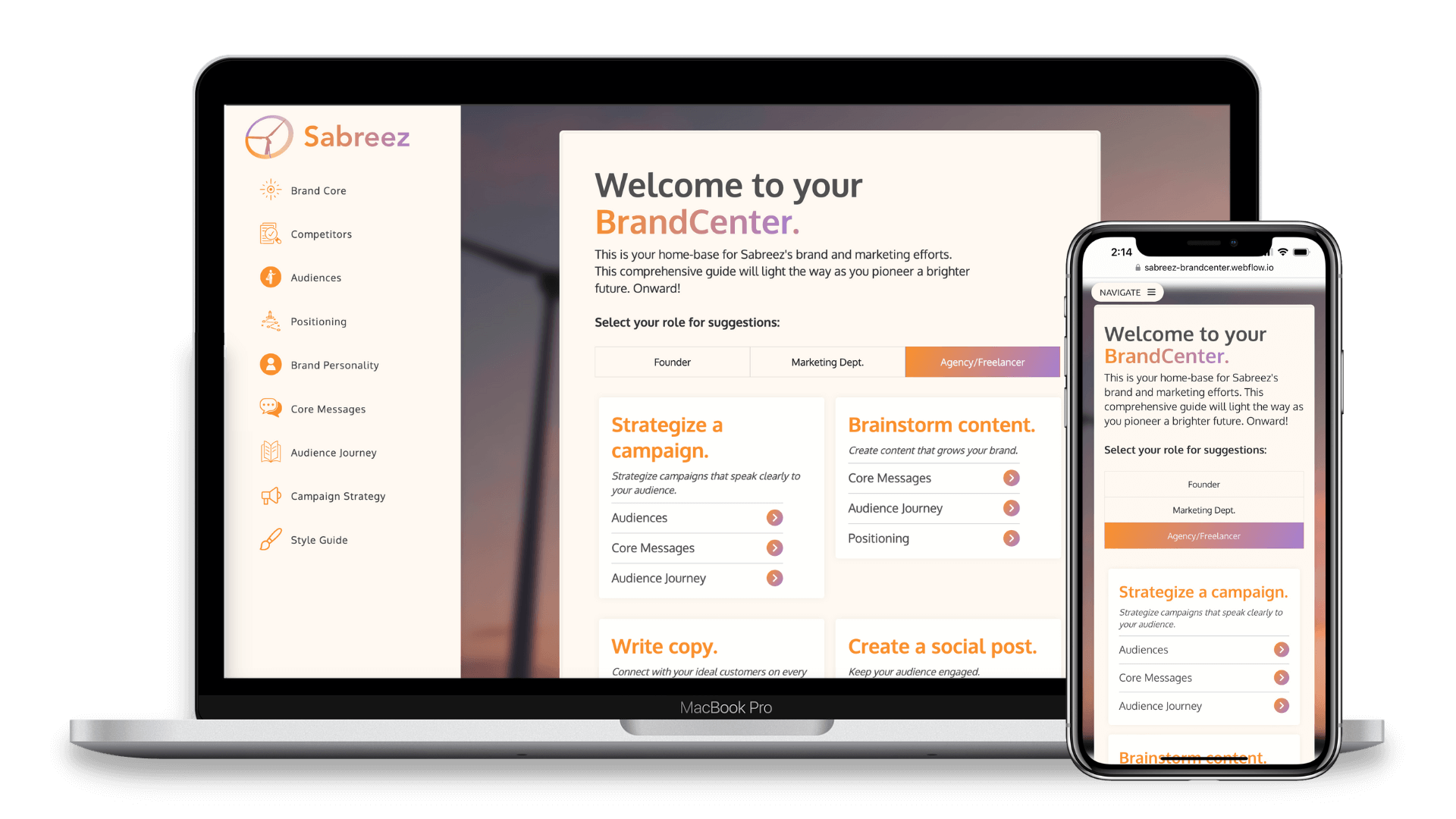
Coastal Captain's custom BrandCenter.
Harmony in every hue.
With a solid brand strategy in place, we moved to refresh Sabreez’s visual identity. We wanted the brand to feel both calming and empowering, balancing technical innovation with a sense of natural simplicity.
We chose a color palette of purple and orange, evoking the calm of a sunset—a time of transition and harmony with nature. These colors reinforced the idea of taking control during the most abundant times for clean energy use.
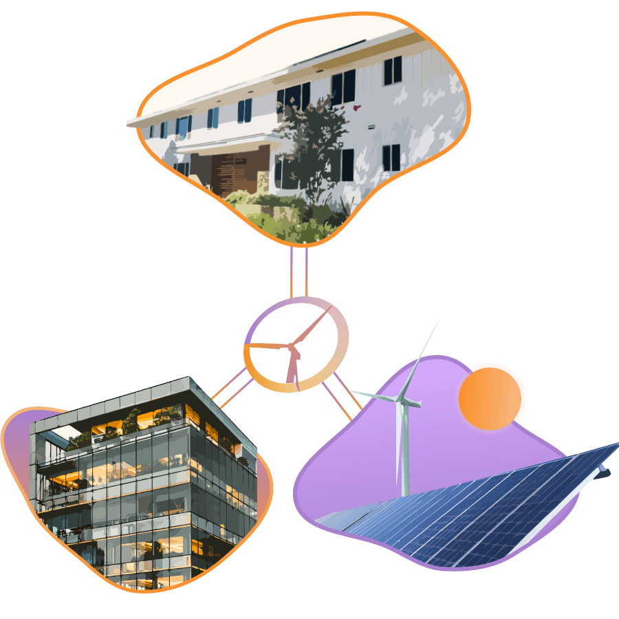
We also developed custom illustrations that visually represented the connections Sabreez helps create—between CEPs, renewable energy sources, and the families they serve. By focusing on these relationships, the visual identity helped bring to life the central promise of Sabreez: simplifying the clean energy transition for entire communities.


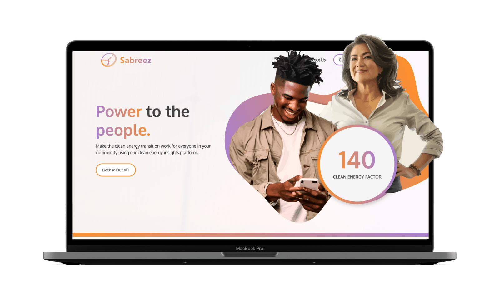
Designing clarity.
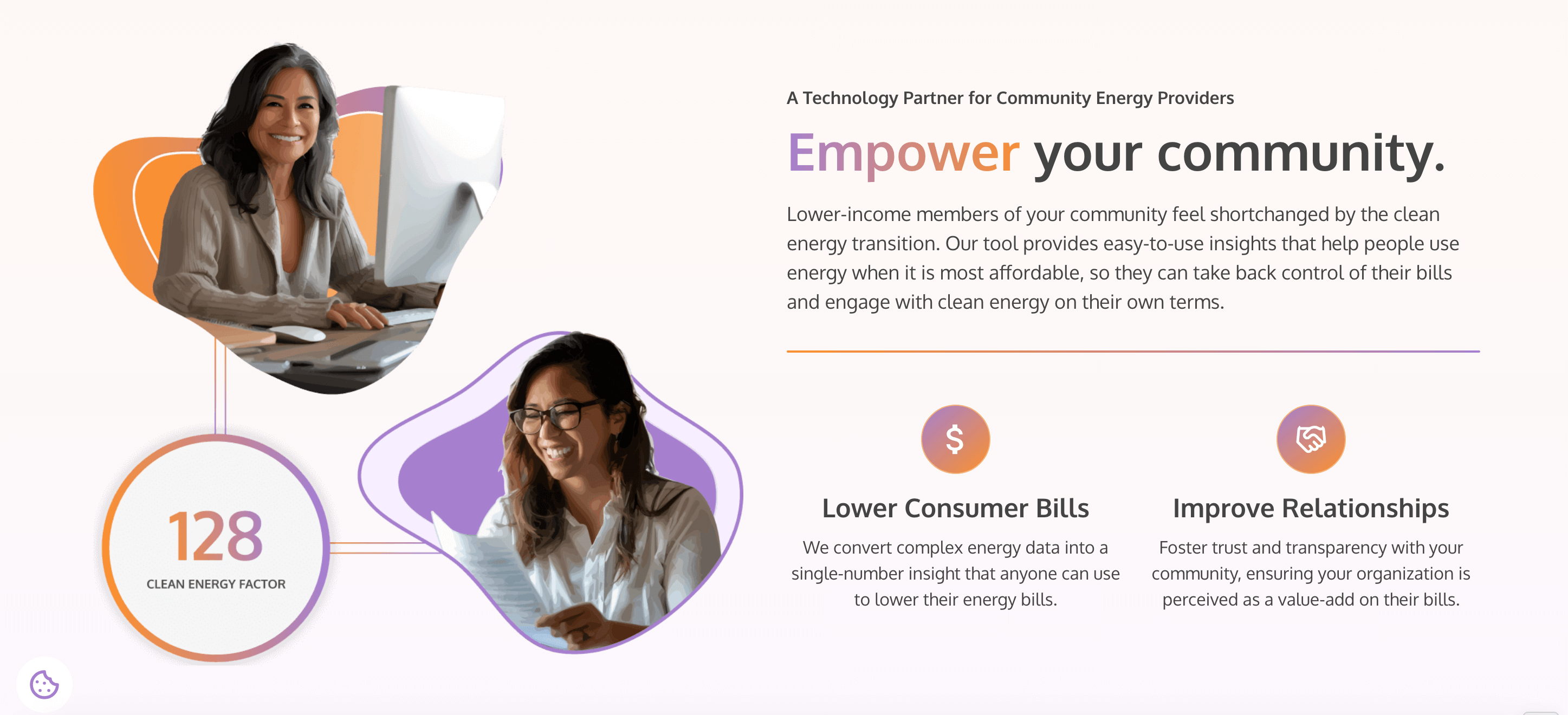
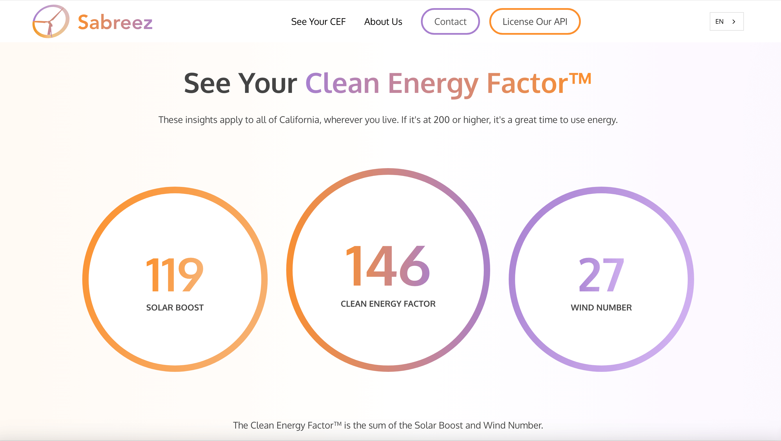
The website had a specific target audience—program managers at CEPs. These decision-makers needed a clear, compelling way to understand how Sabreez could help them manage energy loads, reduce costs, and build trust with their communities. We built a website that communicated Sabreez’s ability to optimize energy usage based on natural patterns, positioning the platform as a tool for shaping community energy use more sustainably.
Read more
Through concise, strategic copy, we framed Sabreez as a practical partner for CEPs, offering clear insights to help them manage their energy loads efficiently without the typical frustrations of emissions-based tracking. We avoided overly technical jargon, instead focusing on the actionable benefits of Sabreez’s platform, making the complexities of energy management easier to digest for these key decision-makers.
We connected the energy data source to a revamped UI design to beautifully display insights to everyday users.
Additionally, we designed a pitch deck to help Sabreez present their solution to investors and partners. This deck outlined how Sabreez empowers CEPs and the communities they serve, while reinforcing the idea of connecting with natural energy flows in a way that is sustainable and cost-effective.
Sharing insight with the world.
The marketing campaign’s goal was to prove Sabreez’s platform could resonate with everyday users. Our mission was to sign up 300 beta testers to show that people could easily understand, use, and appreciate Sabreez’s insights in their daily lives. To achieve this, we created a series of social media posts and ad creatives that highlighted how simple it was to harness clean energy at the right time—making energy-saving decisions feel both natural and empowering.
Our campaign, which included playful yet informative content, emphasized how users could tap into cheaper, cleaner energy by syncing their daily chores with natural energy cycles. This approach resonated with consumers who previously felt confused or frustrated by their energy bills, offering a positive, clear alternative.
The result was a highly successful campaign that exceeded expectations, bringing in over 300 beta testers at a much lower cost than initially projected. This validated Sabreez’s platform, proving that users not only understood the value but were excited to use it.
Read more
Through concise, strategic copy, we framed Sabreez as a practical partner for CEPs, offering clear insights to help them manage their energy loads efficiently without the typical frustrations of emissions-based tracking. We avoided overly technical jargon, instead focusing on the actionable benefits of Sabreez’s platform, making the complexities of energy management easier to digest for these key decision-makers.
Additionally, we designed a pitch deck to help Sabreez present their solution to investors and partners. This deck outlined how Sabreez empowers CEPs and the communities they serve, while reinforcing the idea of connecting with natural energy flows in a way that is sustainable and cost-effective.


Advancing clean energy.
By the end of the project, Sabreez had a fully realized brand that positioned them as a game-changer in the energy insight market. With a refreshed visual identity, a website tailored to program managers, and a successful marketing campaign, Sabreez was able to demonstrate the power of their platform in a way that felt intuitive and accessible.
They are now well-positioned to continue their mission of making the clean energy transition accessible for everyone, helping both CEPs and everyday users take control through actionable insights, all while staying connected to the natural rhythms of renewable energy.