“We worked with Asa to create a new brand identity and website for our startup and he did a stellar job. He was easy to work with, responsive, and offered great insights. It was a pleasure working with Asa.”

Deliverables
Brand Strategy
Visual Identity
Logo Refresh
Logo Animation
Product Naming
Website
Mycoprotein: better than meat.
The Better Meat Co. helps food companies make meat with a hint of magic by offering plant protein formulations that seamlessly incorporate into ground meat, thereby reducing costs, improving nutrition, and enhancing flavor and texture, all while appealing to the growing population of ‘flexitarians’ worldwide and reducing the footprint of the meat industry.
As a result, they received $8M in seed funding in the summer of 2020.
Now, The Better Meat Co. is poised to completely revolutionize the food industry with their next-generation mycoprotein offering, Rhiza.
Read more
With the ability to drastically reduce the environmental impact, cruelty, and cost of the current meat industry, their new superfood ingredient Rhiza will provide meat-lovers with a nutrient-packed, sustainable, and most importantly, meaty plant protein option.
In fact, blind taste testers say it’s the meatiest plant protein they’ve ever tasted. And this isn’t just an experiment––as of June, 2021, they’re ready to begin producing Rhiza at scale. More nutritious, sustainable, and efficient than soy, wheat, or pea proteins, Rhiza is like nothing seen before in the B2B ingredients space.
Strategizing the future of food.
As part of my brand strategy process, I conducted several interviews with their past clients, and even ideal clients such as food innovation leaders at Starbucks, Amazon, Johnsonville Sausage, and more.
I also led expansive competitive analyses of The Better Meat Co.’s global competitors to uncover opportunities for differentiation. These insights (along with those gathered during our conversations with The Better Meat Co. leadership team) helped inform a new brand personality, visual identity, and user experience.
Read more
I also helped The Better Meat Co. to rename their entire product line with a more concise and clear nomenclature, simplifying their ordering process and making it easier for customers to find the right ingredient for their needs.
Equipped with extremely detailed buyer personas, a brand personality toolset including extensive vocabulary and tone guidelines, and a versatile communication framework for Rhiza, The Better Meat Co. is prepared to present a consistent, appealing, and persuasive brand to potential clients and stakeholders.
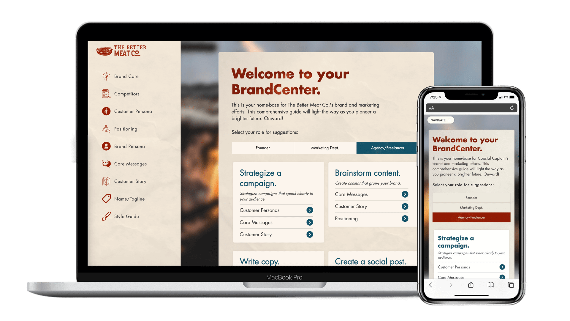
Best of all, this full brand strategy documentation is contained in a custom-coded, password-protected, mobile-friendly online compendium, customized to their new brand.
Visualizing the next generation of meat.
After reviewing The Better Meat Co.'s existing assets, I worked with a designer to create a new style guide, which included a full color palette, typography set, patterns, mockups, templates, and more.
Luckily, The Better Meat Co. already had a clever logo. However, the current color was a bit drab. So, we brightened it up, infusing it with a meatier, more classic red color.
Then, I worked with animator to create a magical logo animation to be used in advertisements, presentations, and even as an email signature.
Before
After
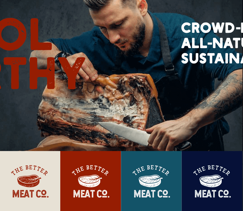
The final stylescape which inspired the full visual identity.

Appearing seamlessly in a puff of smoke, The Better Meat Co.'s new animation conveys the simplicity, ease-of-use, and awe-inspiring innovation of their products.
Building a website for a global business with a startup feel.
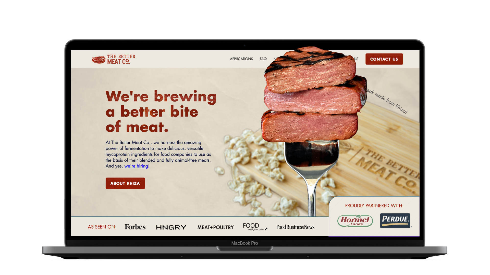
The Better Meat Co.'s Squarespace site served them well in their first year or two, but as they launched Rhiza and pitched their product to massive conglomerates, it was time to upgrade to a custom Webflow site.
Alongside the redesign, I wrote all-new copywriting aligned with their new brand personality.
Using the Webflow Editor, their team will be able to easily add new ingredients, news articles, and team members with just a few clicks.


